Archive
The work shown below represents a glance in our rear-view mirror. A selection of projects that we think have stood the test of time. Some – such as our award winning brand creation for Diil mobile in Estonia – as far back as 2004.

Financial
Frog Capital
This private equity firm started life ten years ago as a ‘family office’ backed by one of Europe’s most successful entrepreneurial families. In 2009 we helped uncover the new name, inspired by the nature of the business – Frog helps companies metamorphosize – as well as its cleantech/green focus and a simple desire to be different. With such a bold name we opted for a simple logotype and a monochrome palette. A small frog print is used as a secondary ‘signature’. We designed everything from the website to signage, stationery to printed collateral.

Sports
One Foundation
One Foundation is a charitable trust set up by our Dominion client Ben Cooke in Jersey. It’s purpose is to provide financial assistance to ensure sports and other community based projects in the island are able to achieve their full potential. We designed the visual identity to work across the many sponsorship activities the foundation will become involved with. We enjoyed creating the brand from scratch which was launched at The Island Games and featured our new Jersey team strip.
Technology
Broadview Energy
With a growing demand for wind generated power in the UK, Broadview energy came to us initially to upgrade their website. After some analysis we persuaded them that it was worth having a deeper look at how the business presented itself to a very diverse audience. As a developer, constructor and operator of wind farms throughout the UK Broadview needed to present this often controversial industry in a clear and open manner. We built the design around the idea of energy and movement with an animated logo and fact based statistics on the homepage.
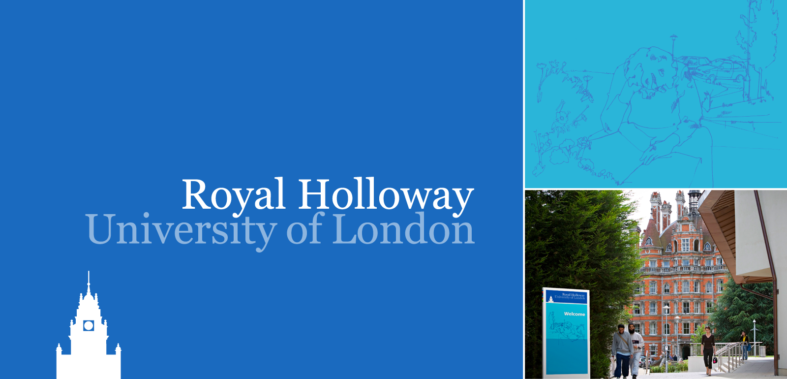
Education
Royal Holloway, University of London
A new brand identity for Royal Holloway, University of London. We started by inventing a design system that feels as comfortable on a printed page as it does in the digital environment. The logo provides a reference to the imposing Victorian Founder’s Building at the heart of the campus. To complement Phil Cook’s quirky photography, we commissioned illustrator Chloe Mutton to capture the essence of the campus.

telecoms
Diil
It means ‘deal’ in Estonian: it’s the country’s low cost mobile network. Along with strategic consultants Hensley Partners we created from scratch what has fast become a cult brand. Built around the idea that “We didn’t have any money left for design” we came up with everything from hand drawn logos to a new typeface ‘Diil Bold Collapsed’, through to launch concepts and SIM card packaging. The designs were created in English then translated into Estonian by a local advertising agency.

FINANCIAL
Citi
Working with our partners Michael Wolff and Simon Paterson we designed and produced a brand book for Citi. The idea was to help educate Citi’s senior employees about the power of branding and the potential of the Citi brand. We were lucky enough to be able to commission many original pieces from illustrators Huntley Muir, Andrew Pavitt and Tony Lorus as well as photography by Phil Cook and Stuart Gill.

healthcare
Health Innovation Network
HIN is one of 15 new Government-backed Academic Health and Science Network regions, which is encouraging information sharing on a local and national level for senior medical and management NHS staff. Clearly, the first step for the Government’s newly created South London Academic Health and Science Network was to come up with a shorter name. The idea was to create a simple wordmark and supergraphic which suggests both the idea of connectivity (between the various health institutions) and hints at its South of the River geography.

healthcare
ABPI
The ABPI (The Association of the British Pharmaceutical Industry) needed to refresh their image of 40 years. Working with our friends at Hensley Partners who lead the research and repositioning part of the project, we worked to translate the strategy into a fresh new look. Based on the idea of smaller components collaborating to create something bigger, we designed the geometric tree inspired by an ancient medical symbol. We then brought the tree to life across everything from signs to digital formats and print applications.