Category: Work

Work Category

&Then

Creating a new work style for The City

Branding — Property

&Then

We worked with long standing client Riverside Capital to create a brand for their new managed office platform. &Then creates beautiful workspaces and tailored offices built around the highest spec. sustainability, connectivity, design and service.

We created the new design in neutral greys to enable it to sit alongside the individual location brands. We designed and built the website, art directed all the photography and wrote the lead copy which we then implemented across the whole range of applications.

ESG facts not fiction

Accelerating the shift of capital towards a more sustainable economy

Branding — Fintech

Impact Cubed

With their mission to accelerate the shift of capital towards a more sustainable economy, Impact Cubed are obsessed with exposing greenwashing across the global investment community. By collating and creating outcome-based impact data for all listed companies globally – they give investors true insight into their environmental and societal impact.

“We chose L&Co because they genuinely care about sustainability, and also brought world-class brand strategists and designers with international experience and a willingness to work with us as partners. It turned out to be a good choice.” Said Libby Bernick, the CEO.

The final identity is based around Impact Cube’s model, adding the third ‘Impact’ dimension to the traditional investment axis of ‘Risk’ and ‘Return’. The lower case ‘i’ plays on the information symbol and the precise geometric cubes and bold colour palette create clear differentiation from competitors.

“L&Co’s work on the design system, the website and our sales deck has really helped us to clarify our proposition and the way we communicate to potential clients. And they’ve been great to work with, adding impressive skills to our team” said Chris Lee, Head of Marketing at Impact Cubed.

Helping self-funding patients navigate private healthcare

Helping self-funding patients navigate private healthcare

Branding — Medicine

Compare my Care

Compare my Care is an independent online comparison site for self-funding healthcare purchasers. With the NHS under huge pressure many people are turning to private care without insurance. CEO Oliver Bee spotted an opportunity to create an online guide to empower patients to find the best surgeons and hospitals for their specific needs.

The site is designed to appeal to an older audience and uses a bold colour palette to stand out from the plethora of blue medical sites. We employed clean graphics and icons to help walk visitors through the process: Search – Review – Select – Book. The design also works to create the sense of an objective advisor, allowing you to match your needs with sub-specialist consultants and hospitals through accurate information and algorithms.

Re-inventing the post-pandemic workplace

Re-inventing the post-pandemic workplace

Marketing Communication

Yarnwicke

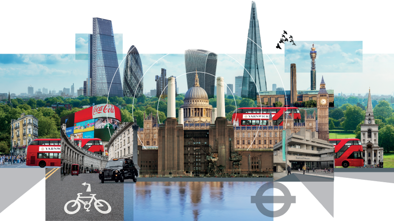
Yarnwicke will be one of the first in a new generation of post-pandemic City based workspaces when it comes on the market in Q1 2022.

Developed around its historic structure, Yarnwicke has been redesigned to create a flexible range of workspaces all with independent airflow systems, opening windows and upper floors that include ingenious terraces with views of the London skyline. All developed to the highest specification including separate bike access and storage, showers and other shared facilities.

We worked closely with the developers to create all marketing materials, directing and collaborating with a range of specialists to help us produce the website, film, marketing suite and printed collateral.

Marketing Suite image
Brochure mockup
Brochure mockup
Terrace CGI
Lazy Coffee bike
London drone image
Bus photo
Architecture illustration
Interior CGI
Pexels photography
British Rail sign
Bloomberg Arcade

Kestrel’s technology landscape

Kestrel’s technology landscape

branding — finance

Kestrel

As Covid-19 swept the globe and many businesses retreated into the shadows, Kestrel Partners decided to step up. Fulfilling the role traditionally occupied by the ‘old banks’, Kestrel’s expertise in business critical software enabled them to invest in and support this vital stream of the economy.

Nine years since we first worked together, Kestrel asked us back to refresh their visual identity as they shifted focus and grew. Retaining the same simple idea of rotating the Kestrel ‘K’ to form the bird icon we then introduced an illustrative technology landscape to suggest Kestrel’s ability to spot potential opportunities. The warm muted colours and serif typography lend a sense of Kestrel’s considered and forensic approach.

We brought the new identity to life across a range of applications including the website, social media posts, presentations, stationery, signage and even their own cycling strip. The business continues to flourish.

Kestrel Business Cards
Kestrel – Rapha

Dominion

Repositioning a boutique financial business to compete against corporate giants

branding — finance

Dominion

Ten years after we helped relaunch privately owned financial services business Dominion, they invited us back to re-position the firm to appeal to a new global corporate client base. As a small minot now swimming with the private equity backed giants in the corporate world, we re-defined Dominion with their long-term Mittlestand philosophy as the people who are able to go the extra mile for their clients: Dominion. Do more.

We then tailored this message to the two audience groups. Building on the black & white design system we created a decade earlier, we introduced two support colours to help private and corporate clients navigate to the relevant services. We also created a ‘Dominion in 60 seconds’ animation to help re-define the business.

The refreshed branding has helped to re-energise Dominion as they open several new offices around the globe.

The Expert
Dominion T Shirt

Optima Health

Launching a fresh look to support workplace health and well-being

Optima Health illustration

BRANDING — healthcare

Optima Health

Launching a fresh look to support workplace health and well-being

Optima Health is tasked by some of the UK’s largest public and private sector employers to manage and support both the physical and mental health demands of their staff.

With the merger of two businesses and the rapid uptake of wearable health technology the opportunity for Optima Health was to deliver health support across a range of organisations, geographies and environments. Working closely with their leadership team we started by defining a brand strategy before bringing it to life through a new brand identity.

The new identity is centred around the ‘O’ symbol, which reflects the multiple strands of health services provided. The rich colour palette supports this and enables Optima Health’s identity to stand out within larger client organisations. The illustrative icons represent both the physical and mental health dimensions of the business as well as the four primary service areas.

We have produced everything from an explainer animation to exhibition stands, digital assets to data sheets, mobile medical centre liveries to a launch booklet. The branding has helped galvanise the business as it steps into this new era of holistic workplace healthcare.

ThirdSpace

Defining a new space for digital security & identity

branding – tech

ThirdSpace

Microsoft identity and digital security experts Oxford Computer Group approached us with their own identity crises. Their former colleagues and namesake in the US were causing confusion within the market. The business enables customers to access their data securely, providing protection while enabling people to work at home, at work or indeed anywhere – a third space. We created the name and descriptor: the control to liberate, bringing the new brand to life through a new logo and supporting design framework. The square brackets from the logo expand and contract across the visual identity to frame elements within photography and word play, suggesting the idea of security anywhere.

ThirdSpace
ThirdSpace whitepaper
ThirdSpace
ThirdSpace
ThirdSpace

TalTech University

Inventing the future for Tallinn Technological University

branding – education

TalTech University

To celebrate 100 years since it was founded, Tallinn Technological University (Tallinna Tehnikaülikooli) asked us to review and refresh their brand identity to take them into their second century. Despite their distinguished record for innovation including: early computer research, the development of Skype technology, and the code behind E-Estonia – the university has struggled to build a reputation beyond its national borders.

A fresh brand strategy was created by our friends at Hensley Partners, positioned around the idea of leading Estonia and the world into a sustainable digital future. Working alongside the Rector, it was agreed to shorten the name to TalTech, to resonate internationally as well as with the younger generation. We decided to place the bold new name at the centre of our designs, creating a two line logotype that sits over or is filled with imagery.

We enhanced the historic cherry red with a bolder colour palette and created a design framework that balances flexibility with consistency to enable the local agencies and inhouse designers to implement the new identity across a myriad of applications. The new brand identity was launched on 17th September and has drawn much favourable comment from the University’s community and Estonian press.

TalTech University
TalTech University
TalTech University

Worldpay

A single global brand identity

branding – finance

Worldpay

In August 2017, Vantiv and Worldpay, announced a $10.4bn merger creating the world’s largest payments processor and becoming a Fortune 500 company. Our partners MBLM in New York worked with Worldpay to develop a strategic brand platform, promise and tagline – Advancing the ways the world pays. Concurrently, a brand architecture framework was developed to streamline and rationalise the product offerings. Once the new logo had been created MBLM invited us to work with them to design the visual identity system and establish the new look and feel. Working closely with the client’s marketing and communications teams in the US and UK, we created the assets, templates, a proprietary typeface, image and icon libraries. In support of bringing the newly merged companies together, we helped create specific components for the internal values and brand launch. This included digital and print communications as well as environmental applications. The launch has been a great success, presenting an engaging, unified outlook to their colleagues, customers, company, and communities.

Worldpay logo
Worldpay
Worldpay Sans
Worldpay Sans
Worldpay
Worldpay white paper
Worldpay

Placer

Bringing democracy to student work placements

branding — tech

Placer

The idea behind Placer is to democratise work experience to ensure a more diverse range of students have access to these vital opportunities. Using the latest matchmaking technology, through employer dashboards and student screens, Placer connects employers offering quality opportunities with students. As Tinder does for dating – the Placer mobile app allows students to swipe left or right in search of their perfect work experience match. With input from a small group of potential candidates we created the name and then developed the brand identity based on a location pin placed into relevant imagery. We worked alongside the technology team to create a coherent messages and style across the range of digital applications, designing the explainer animation and creating social media content along the way.

Placer promo posters
Placer app
Placer app
Placer app
Placer app
Placer brand guidelines
Placer - app icon
Placer branding header

PPP Taking Care

Helping AXA PPP reach an older demographic

Branding — Healthcare

PPP Taking Care

AXA PPP asked us to create a brand identity for their newly formed business PPP Taking Care. The new setup sells a range of products and services including alarm pendants aimed at older people to enable them to remain living independently. We wanted to celebrate age by putting black and white portraits at the heart of the new identity, so brought in Karsten Thormaehlen – known for his portraits of centenarians – to photograph our over 75 year old subjects. Take a look behind the scenes of the photoshoot.

The new logo uses hands as a motif to suggest how PPP Taking Care helps those who need a little extra support. The secondary read of a fingerprint implies the easy touch-of-a-button nature of the services.

full-width_PPP TC_IMG_7872
PPP_Jenny
PPP Behind the scenes
PPP_Bruce
PPP Behind the scenes
PPP_Wendy
PPP_Make-up
PPP TC_Leaflets
PPP Brand Guidelines

Creative Conscience

Designing to encourage students to use their creative skills for social good

Creative Conscience Awards 2017

L&Co + Creative Conscience

Creative Conscience

We continue to work collaboratively with Creative Conscience, a global movement promoting socially valuable, human centered design and creativity. Through their student awards scheme, events and impact projects, they enable and inspire people to use their creative talents to make a positive impact on the world around them. It’s something we’re really proud to be part of.

Recently, we’ve been working with winning students and graduates from Creative Conscience to create a new campaign for the 2018 awards. Taking inspiration from the tone of voice and techniques used to make protest posters and street art, we moved away from our computers to create custom type, icons and background styles, which were then implemented across their digital platforms.

We support them out of the office too, often attending events, talks and workshops to spread the cause.

Creative Conscience
Creative Conscience
Creative Conscience
Creative Conscience
Creative Conscience workshop
Creative Conscience Awards 2017

Trailight

Shining a light on accountability within financial organisations

branding — fintech

Trailight

Five years after we created the name and visual identity for Trailight, the financial compliance software business invited us back to refresh their communications. Since our initial engagement the business has enjoyed impressive success signing up some of the largest financial institutions in the world to help them tackle sweeping new accountability regimes. Continuing the idea of shining a light into dark corners we commissioned Josh Patterson to create a series of engaging illustrations to convey how Trailight software simplifies the growing complexity of compliance.

Trailight logo
Automation
Monitoring Performance
Competence Framework

Unsaid Communications

Finding a voice: Creating a framework to help tell stories

Unsaid Communications

Branding — humanitarian

Unsaid Communications

Unsaid Communications work with people to tell their stories through a range of skills from photography, film and layout to sound and words.

Founded by Swedish humanitarian Mats Lignell, Unsaid is driven by the belief that everyone has an equal right to a voice – helping people tell the untold and say the unsaid. L&Co came up with the name, and created a simple design framework to help tell a coherent story around this collection of evocative and engaging imagery.

Unsaid Communications
Unsaid Communications logo lockup
Unsaid Communications

Riverside Capital

Turning a few heads with a new identity for Riverside Capital

branding – property

Riverside Capital

Riverside Capital are obsessed with property, they understand it outside and in, working with UK and international clients to invest in the UK property market. Their passion for high quality and detail enabled us to create a clean simple visual identity, that combines elegant typography with Ben Rice’s specially commissioned photography of people and buildings: contrasting cityscapes with architectural close-ups helps to reflect both their broad knowledge and attention to detail. We started with the website and extended the new designs into the tactile world of printed media, using foil blocking and textured stocks where appropriate. The final touch was to turn people’s heads with a simple logo and strap-line.

Riverside Capital - View magazine
Riverside Capital, View magazine illustration
Riverside Capital – Skyline
Riverside Capital stationary

The Marvellous Meat Company

Our latest venture design project – The Marvellous Meat Co.

The Marvellous Meat Company

branding — food & drink

The Marvellous Meat Company

Every few years we like to take a punt on a great idea, and do what we call venture design. It means we form a true partnership with our client, share the risk and hopefully the reward. Behind The Marvellous Meat Company is a simple idea – an online farm shop selling delicious grass fed Sussex beef, prepared on-site by our own master butcher then dry hung for 28 days and delivered direct to the consumer.

To emphasise the provenance we adopted a British flavour to the name and design, then commissioned photography of the cattle in their native Sussex farmland. We designed everything from the delivery boxes to promotional cards, as well as the online shop itself.

The Marvellous Meat Co - work in progress
Marvellous Meat Co logo
The Marvellous Meat Co
The Marvellous Meat Co boxes
The Marvellous Meat Co - product boxes
The Marvellous Meat Co flyer
The Marvellous Meat Co infographic

JLL

Keeping global real estate business JLL fresh, relevant and consistent

JLL London cityscape

BRANDING – PROPERTY

JLL

We started by reviewing the brand identity of this global property company. We helped create their property marketing design system so that condos in Sydney and offices in New York can be presented with a consistent look and feel. We commissioned young photographers Lillian Wilkie, Mindaugas Komskis and Lex Fleming to find fresh angles on architecture around the world, and illustrators Chris Dent, Chloe Mutton and Diana Boyle to draw cityscapes. We’ve created guidelines for signs and interiors and more recently we were asked to create an animation for the annual MAPIC retail property conference illustrating six facts about the global retail market.

JLL Brand Book
JLL Brand Book
JLL - Red

Icelolly

Refreshing new look for holiday price comparison site Icelolly

branding — consumer

Icelolly

With nearly a million unique users every month, Icelolly, the holiday price comparison site is going for a bold expansion plan. Working with such an evocative name made it easy and was the basis for our design language which uses bold overlapping colours and masked photography to suggest the broad range of available holidays. Icelolly loved the design so much they asked us to create an advertising campaign to help build greater awareness.

Icelolly tube ad
Icelolly guidelines poster
Icelolly website - Before - After