
Hello. We’re L&Co, a London based design and branding studio.
We work with a range of organisations to define who they are and create compelling communications to help them achieve their ambitions. Underlying all our work is the love of our craft and the belief that design should have a positive impact on the world, it’s why we’re a certified B‑Corporation®. View our showreel
Work
Monitoring climate news coverage
Work
Pioneers in healthy longevity
Work
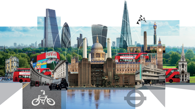
Creating a new work style for The City
Work
Accelerating the shift of capital towards a more sustainable economy

News
Graphic design with a (creative) conscience

News
Read our 2022 Impact Report

Work
Helping self-funding patients navigate private healthcare

News
Making hydrogen power a practical proposition
News
10 Years of Creative Conscience
News
Investing in London’s future workspaces

News
Helping Estonia’s largest brands navigate out of the pandemic

Work
Shining a light on accountability within financial organisations

News
How to draw an alphabet one day at a time

Work
Re-inventing the post-pandemic workplace
Work
Kestrel’s technology landscape

News
William Wates Memorial Trust

News
Covid-19 graphics that inform
Work
Repositioning a boutique financial business to compete against corporate giants

News
G9 Ark launches at the UN Climate Action Summit
News
L&Co declares a climate emergency

News
Assessing the efficacy of the Emirati’s most valuable brands

News
High-quality student accommodation an oxymoron? Discuss

Work
Helping AXA PPP reach an older demographic

News
Helping to create impact for Creative Conscience
